It’s all fine and dandy to have a PPC ad or other online advertising tactic that’s driving people to your law firm’s landing page. But what if that page isn’t converting at the same rate you are driving people there?
Let’s review the reason a landing page exists anyway: to convert visitors coming from marketing campaigns as quickly as possible. Remember, this is not your law firm’s website, this is an entirely different beast.
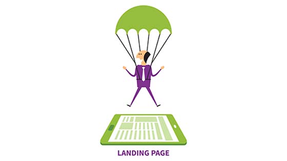
A landing page is a digital space for content and eye candy designed to make visitors react and take action related to a topic your lawyers deem important for generating new cases. You want people to call your law firm, fill out a short form for more information, chat live with an intake professional, and other various methods of facilitating communication, conversions – and ultimately, cases.
So how do you fix a landing page that should be making people take action but instead is just sitting there stagnant? Easy. Here are three top reasons landing pages struggle to convert and how your legal team can fix these issues starting today.
PAGE CLUTTER!
Most landing pages simply try to say too much and end up not only confusing visitors, but turning them off entirely from taking action. It’s like paralysis by analysis. Give people too much information to sort through, digest and try to make a decision about and they won’t be able to do anything at all.
The obvious fix – less is more! Stop trying to stuff as much content as possible on a single page and really think about how to hone your message to its essence. The best way to constrain your content is to think “above the fold.” A landing page is not the place for people to scroll for more information.
Every element should be available in one glance, a snapshot on a screen, large or small. You’ll need a professional designer to properly infuse your landing page with your legal brand’s look and feel—and a strong copywriter if you can’t seem to contain your message.
Think of your legal landing page as a little puzzle, where each visual element leads to the same singular call to action. First focus your efforts with a very straightforward headline that will center the reader. (You’ve got 3 seconds to hook them.)
After a simple headline in a large font size, a smaller sub-headline should follow to clarify the lead message. Under that comes your concise body copy—a few lines at the most. Breaking it up with bullets, lists or color is even better. Next to body copy you’ll need a strong lead image or video to showcase that eye candy that most people are used to these days. Then comes a highlighted CTA button.
The basics:
- Headline
- Sub-headline
- Body copy – quick description of what you’re offering
- Image or video – 1 or 2 max
- CTA button
- Brief form
- Logo
Sometimes that’s enough, but we also know from trial and error that a brief, authentic testimonial works well on landing pages to establish immediate trust. Think of all these visual elements coming together as a neat little puzzle or pathway that inspires and guides a visitor to do what you want them to.
MISSING CTAs!
We just talked about how the call to action (CTA) element should be one of the most visible features above-the-fold, but surprisingly many landing pages forget to include a CTA altogether!
Don’t be that landing page. Before you begin to tweak your law firm’s contextual elements make sure you really know what you want visitors to do on this landing page.
- Are you focusing on having people fill out a form that will garner lots of leads for you to sort through and follow up once you’ve had a chance to vet them?
- Do you want people with a particular legal challenge to call your office right now to tell their story?
- Do you want to invoke a live chat, video view or the push of a button to capture more information?
It’s up to you, but please decide on one driving CTA and stick to it.
Once you’ve settled on a CTA, make sure, just like the layout of your landing page, that it is also simple, to the point and doesn’t require too much of a visitor. Also keep in mind where the visitor might be accessing the page from – desktop or mobile device?
- TIP: In 2015, mobile search outpaced desktop search, so:
- Make sure your landing pages are responsive!
- If focusing on desktop users, the contact form should be prominent with a CTA.
- If focusing on mobile visitors, the phone number should be front and center with a CTA.
Remember, a landing page is not about selling your law firm. A landing page exists to entice a visitor to take action, and people need to feel safe, secure and supported to do that.
People are also short on time—and patience. Not only are they wary about giving out too much information online, they don’t have time to do it even if they are so inclined. So don’t ask for too much. Keep your forms and requests simple for the user.
BLIND FAITH!
Would you expect a prospective client to take your law firm seriously on bind faith alone? No. You need to expect leads to vet you just like any other professional service business before they made the decision to work with you.
Well, the same can be said for your landing page. You can do all the things we’ve mentioned here, but you can’t go on blind faith that it will always work—or will always work the same way to convert visitors to clients.
Like your new legal clients, you’ve got to do some due diligence on the performance of your landing page. That means running the numbers and testing new variations if conversion rates are not trending upward.
The best statistics to monitor on your landing page (via Google Analytics) are:
Bounce rate: Just because your ad is delivering traffic to your landing page doesn’t mean people are staying there long enough to take action. Filter your bounce rate view by campaign and source.
Unique visitors: This metric only tells you about traffic, but it’s the first piece in determining how effective your campaign is at converting. Make sure you’re getting the right kind of traffic (people), too.
Conversion rate: How many unique visitors completed conversions? That’s usually more than completing an online firm or making a phone call. You need to decide what a conversion (the end goal of your landing page) means for your law firm.
Time on page: If visitors are staying on your landing page, hopefully it’s because they’re interested—and not because they’re confused. The goal is less time spent on the landing page before converting.
Form abandonment rate: If people are filling out a form, then leaving before they complete it, this could mean your form is too long or too demanding.
Traffic source: How are visitors getting to your law firm’s landing page? Google search, Facebook ads, PPC campaign? This will tell you where to allocate put your online legal advertising dollars.
The last element of not buying into blind faith in online marketing is testing different landing pages to see what’s resonating. A/B testing, or trying a few different versions of the same landing page topic, will show you clearly what design, copy and CTA is driving conversions.
Need more tips and tricks for making your landing page convert? Give the digital marketing mavens at Network Affiliates a call to see how you can get more clients today – (888) 461.1016!